Jeto Design · Creative direction by Jiet

From the billboard to the checkout.

Jeto Design makes the campaigns, brands and websites that earn a business its attention. Our creative director, Jiet, also leads product experience for a retail and food-service software platform — the kiosks, ordering flows and loyalty apps where that attention becomes a sale. Two bodies of work, one way of thinking.

Studio
06 projects · Jeto Design
Product
03 projects · In-house
See the work

Chapter 1 of 2 — Jeto Design06 projects

Studio — client work by Jeto Design

Campaigns, brands and websites for clients. The work that gets a business noticed, and gives people a reason to choose it.

Who made what. This chapter is client work by Jeto Design. Several of the websites were delivered together with Solvex Solutions in Singapore, and one project with Orius. Each project’s credits say who did what.

01 / 09

Thomson Health

Two storefronts, rebuilt around the questions people ask before they buy.

Type
E-commerce · Conversion design
Year
2023—2026
Status
Live · ongoing
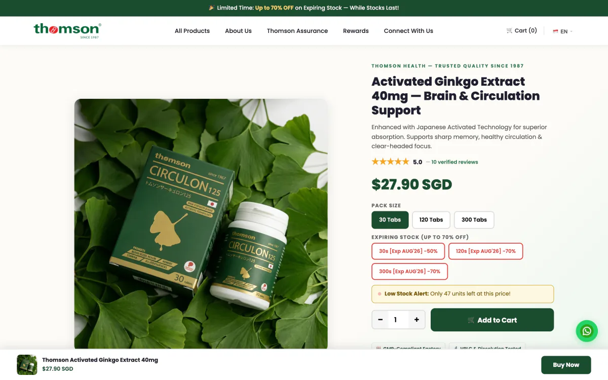
Fig. 1Product page, Singapore store — the whole argument, top to bottom.
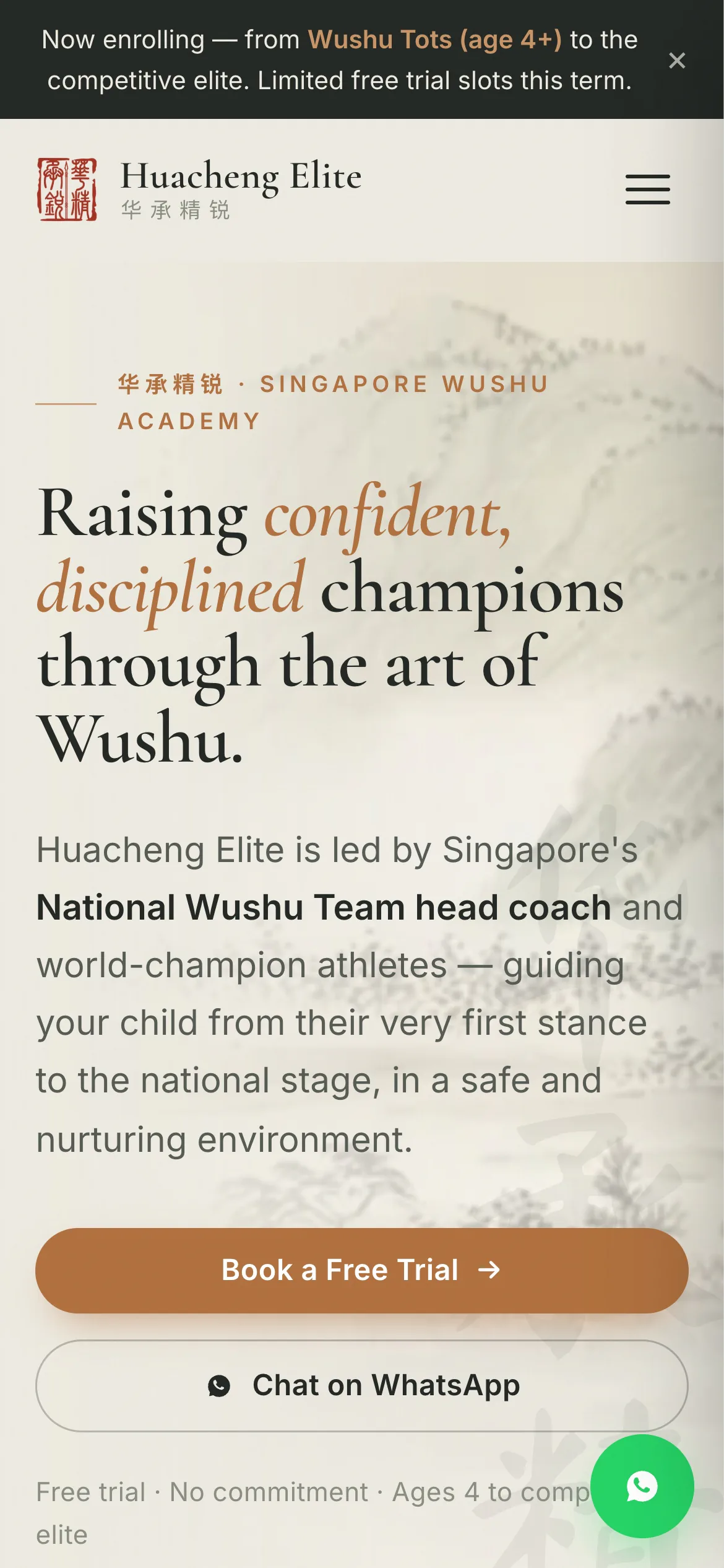
Fig. 2Designed phone-first.
The thinking

Supplements are bought on trust, and trust is built by answering questions in the right order. The product pages for Thomson’s Singapore and Malaysia stores were restructured as one argument: what it is, how it works, what is in it, how it compares, what other people say — with the buy button never more than a thumb away.

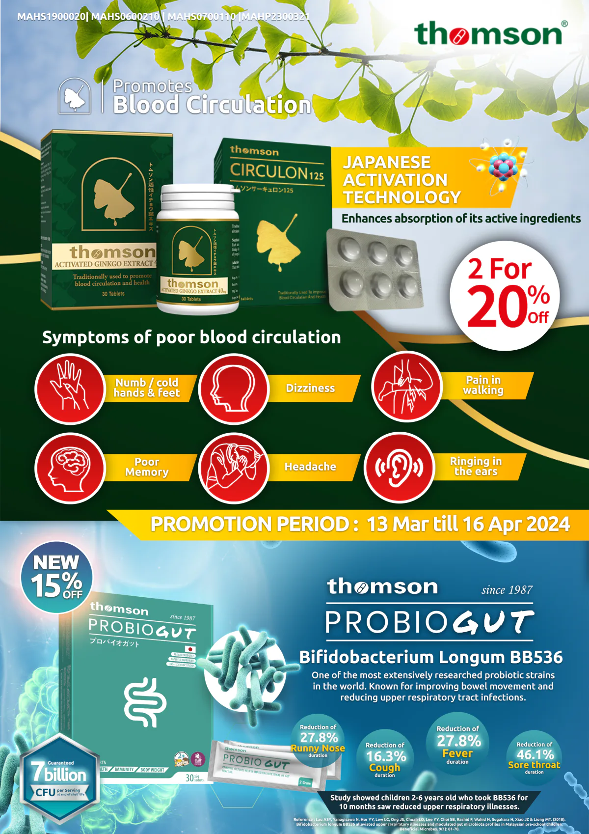
It ships as Shopify theme sections the client’s team can edit, so the structure survives the next campaign. The storefronts are the latest chapter of a longer relationship: since 2023 Jeto has made the brand’s marketplace image sets, promotional ads, a retail flyer and the signage on its factory.

Role
Funnel and information-hierarchy redesign, conversion optimisation, theme design and build, paid media and tracking, email, campaign and retail artwork
Deliverables
  • Product-page section system for two Shopify stores
  • A/B challenger page and a reusable product landing page
  • Homepage redesign proposal
  • Welcome email and Meta campaign dashboard
  • Marketplace image sets for seven products
  • Promotional ads, retail flyer and factory signage
Credits
Jeto Design, with Orius on store migration, market routing and technical SEO, and Thomson Health’s own team on medical content. Pack renders and commercials supplied by Thomson.
Case notes — Thomson Health

The problem

Thomson was moving from WordPress to two Shopify stores, Singapore and Malaysia, on a standard theme. The move had to carry years of search equity across, and the new pages had to persuade better than the old ones.

The approach

Split the work by strength. Orius took structure: migration, routing between markets, technical SEO. Jeto took growth: mapping the journey from discovery to checkout, rebuilding the page hierarchy for people reading on a phone, and making sure an ad click can be traced to a sale.

What was delivered

  • Editable product-page sections now running on both live stores
  • A second page variant for A/B testing against the first
  • A landing-page template for single-product campaigns, in client review
  • An introduction email
  • A dashboard that reads campaign results from the team’s own sheet
Fig. 3Malaysia store — product landing page, in client review.
Fig. 4Welcome email.
Under NDA · shown on request

2023—2025Before the storefronts: marketplace tiles, promotional ads, a retail flyer and factory signage.

Marketplace tile, 2025.
Retail flyer, 2024.
Social ad, 2025.
Factory signage, 2023.
Marketplace tile, 2024.

02 / 09

Huacheng Elite

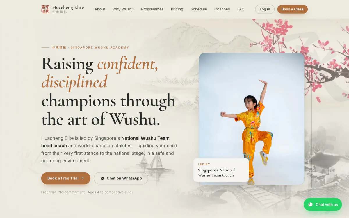
A wushu academy’s front door, and the booking system behind it.

Type
Website · Booking portal
Year
2026
Status
Site delivered · portal in review
Fig. 1Parent portal — a week of classes, booked with credits.
Fig. 2On a phone.
The thinking

Parents choose a martial-arts school on feeling and stay on logistics. The site is the feeling: ink-wash, calligraphy, a head coach from the national team. The portal is the logistics: credits that belong to a family, classes booked up to four weeks ahead, and a console where coaches mark attendance.

Both halves share one cream-and-copper system, so the calm of the front door carries all the way into the admin tables.

Role
Art direction, web design and build, UX for the parent portal and the staff console
Deliverables
  • Marketing site with WhatsApp-first lead capture
  • Parent booking portal prototype
  • Coach and admin console prototype
  • Handover documentation
Credits
Design and build by Jeto Design. Delivered with Solvex Solutions, Singapore.
Case notes — Huacheng Elite

The problem

A Singapore wushu academy wanted a site that wins free-trial sign-ups, and a booking system for classes, credits and leave.

The approach

Design the front door and the back office as one product. Enquiries go to WhatsApp, where the academy already answers parents. Bookings run on credits that belong to a family and to a class type, so siblings can share them.

What was delivered

  • Marketing site with programmes, pricing, schedule and coach profiles
  • Clickable parent portal: schedule, bookings, credits, account
  • Clickable staff console on realistic mock data: students, leave, packages, reports
Fig. 3Staff console — students and credits.
Fig. 4Coach view — tap a class to take attendance.
Fig. 5Credits shared across a family.

03 / 09

Rockbell

A whole software catalogue, redesigned one self-contained page at a time.

Type
Website · Campaign
Year
2026
Status
Live
Fig. 1Homepage — the headline types through the product range.
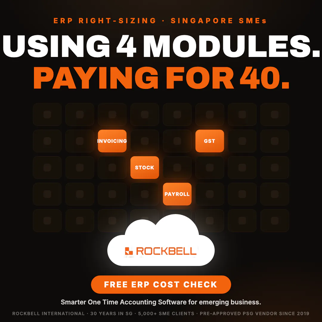
Fig. 2ERP right-sizing — ad creative.
Fig. 3One of twenty product pages, each with its own theme.
The thinking

Rockbell sells accounting, payroll and point-of-sale software to Singapore businesses — twenty products, each with its own audience. The redesign gives every product its own page and its own theme inside one orange-and-black system, and delivers each page as a single self-contained block that drops into the client’s existing WordPress site.

The same system then carries the marketing: a cross-sell campaign to existing customers, with emails, landing pages and ads that each say one thing.

Role
Design system, web design and build, campaign concept, ad creative, email
Deliverables
  • Homepage, 20 product pages and 13 inner pages
  • WordPress upload pack with guide
  • Cross-sell campaign: 3 emails, 3 landing pages, 15 ad variants
  • ERP right-sizing ad set
  • E-invoicing lead-generation playbook
Credits
Design and build by Jeto Design. Delivered with Solvex Solutions, Singapore.
Case notes — Rockbell

The problem

A software house trading since 1996, with a large catalogue to explain. The site runs on WordPress with a page builder, and stays there.

The approach

Work with the constraint. Each page is one self-contained file pasted into the existing page builder, so the redesign could go live a page at a time with nothing to migrate. Contrast is checked on every theme rather than assumed.

What was delivered

  • Thirty-four redesigned pages, delivered as an upload pack
  • A campaign for existing customers under one line: “You already have the foundation — switch on what’s next.”
  • Bold-type ad boards for the ERP right-sizing offer

04 / 09

Prime Aces Limousine

The smallest thing in the car, designed like the rest of the ride.

Type
Packaging · Print
Year
2024
Status
Produced
  1. 01Sketch

    Drawn where it would live: in the holder, within reach of the back seat.

  2. 02Layout

    Three flat layouts, in outline and in colour.

  3. 03Final design

    Black, a gold wave, and one line: “Your reliable partner in business travel.”

  4. 04In the car

    Printed, and in the console. The first sketch is inset for comparison.

The thinking

A chauffeur company sells the feeling of being looked after, and that feeling lives in the things a passenger actually touches. So a wet towel got the same attention as the car: sketched in place first, drawn up as a flat pack, then produced in black and gold to sit in the console as if it had always been there.

It is a small job, and it is here for that reason. The big gestures are easy to get right. A brand is mostly made of small ones.

Role
Concept, packaging design, print artwork
Deliverables
  • Custom wet-towel sachet
  • Brochure and roll-up banner
  • Company presentation
  • Social reels for a partner promotion
Credits
Jeto Design.

05 / 09

Ecoveil

A tissue brand that stops apologising for its colour.

Type
Campaign platform · Activation
Year
2026
Status
Campaign proposal
  • 01Key visual.
  • 02Booth concept — moss wall.
  • 03Launch image.
  • 04Booth concept — kiosk.
  • 05Mascot concept.
  • 06Social system.
  • 07Booth concept — atrium.
  • Unbleached is safer.

The thinking

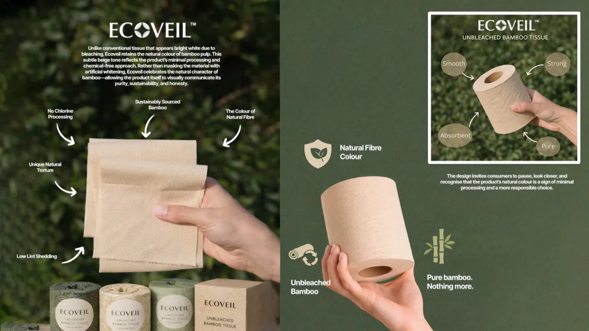
Unbleached bamboo tissue is brown, and on a supermarket shelf brown reads as cheap. The platform turns that around in three words — Unbleached is safer. The colour stops being the thing to explain away and becomes the proof.

One line, carried through retail booth concepts, a mascot, ambassador scripts, a short-film story and a social system. The concept visuals were generated with AI, so the client could choose a direction before a single prop was built.

Role
Campaign platform, creative direction, scripts, concept visuals, paid-media plan
Deliverables
  • Interactive campaign proposal
  • Retail booth concepts: atrium, kiosk, moss wall
  • Mascot concept
  • Ambassador scripts and short-film story
  • Social content system
  • Paid-media proposal
Credits
Jeto Design. Concept imagery generated with AI for the proposal.
Case notes — Ecoveil

The problem

A Malaysian bamboo-tissue brand launching a product whose most visible feature — its natural colour — is the one shoppers distrust.

The approach

Find the sentence first. Then test it everywhere it has to work: on a mall floor, in a fifteen-second script, on a pack shot, as a soft toy. If the line survives all of them it is a platform, not a slogan.

What was delivered

  • A proposal built as a web page the client could click through, with audio for each script
  • Three booth directions: atrium, kiosk and moss wall
  • A paid-media plan to carry the launch

06 / 09

Contact sheet

Eight more sites. No house style.

Type
Websites
Year
2026
Status
Live & in review
  1. 01

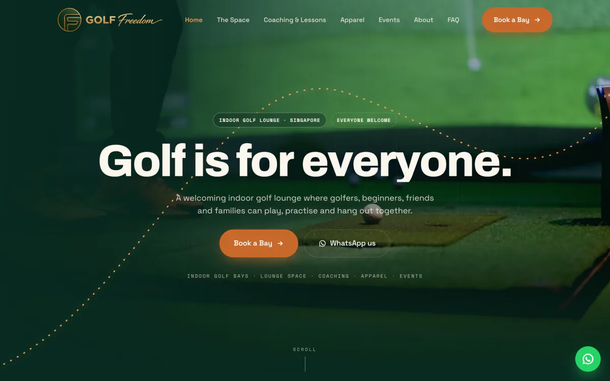
    Golf Freedom

    Indoor golf lounge

    Live
  2. In review · shown on request
    02

    Client withheld

    Club website rebuild

    In review
  3. 03

    International Catering

    Halal event catering

    Delivered
  4. 04

    ADEVO

    Commercial interiors

    Live
  5. 05

    Core Invest Institute

    Trading education

    In UAT
  6. In review · shown on request
    06

    Client withheld

    Corporate services

    In review
  7. 07

    Max-Value Transport

    Warehousing & logistics

    Delivered
  8. 08

    Nav8

    Electronic components

    Delivered
The thinking

A site should sound like the business, not like the studio that built it. These were each built from the client’s own material — a company profile, a content workbook, an archive of club photographs — and delivered in whatever form their team could keep running.

Role
Web design and build
Credits
Design and build by Jeto Design. Delivered with Solvex Solutions, Singapore.

One customer, one journey, two chapters

First, get noticed. Then, get paid.

  1. Seen Ad, feed, billboard Studio
  2. Understood Website, landing page Studio
  3. Decided Product page, checkout Both
  4. Ordered Kiosk, QR, app Product
  5. Back again Loyalty Product

Chapter 2 of 2 — In-house product03 projects

Product — in-house product work

Kiosks, ordering and loyalty for food and retail brands. The work at the point where attention turns into a transaction.

Who made what. This chapter is in-house product work at a retail and food-service software platform, where our creative director leads a small product experience team. The research, UX direction and prototypes come from Jiet and that team; production software is built by the platform’s engineers. None of it is Jeto client work.

07 / 09

Self-order kiosk

A self-order kiosk that lets people think.

Type
Kiosk UX · Field research
Year
2026
Status
Prototype → production UI
  1. Finding 01

    People arrive ready.

    Observed

    Almost everyone began ordering within seconds of walking up. Nobody needed the kiosk explained.

    The rule

    One dominant way to start. Language and membership stay within reach, never in the way.

    Under NDA · shown on request
  2. Finding 02

    Almost nobody scrolls.

    Observed

    People tapped categories and whatever was already visible. Scrolling only happened when something was hidden from them.

    The rule

    A category rail that never leaves the screen, and the items that matter inside the first view.

    Under NDA · shown on request
  3. Finding 03

    Defaults are scaffolding.

    Observed

    Preselected options and combo defaults were accepted readily, and cut the number of taps.

    The rule

    Sensible defaults everywhere. Choices arrive one at a time, each with an easy no.

    Under NDA · shown on request
  4. Finding 04

    Thinking is not friction.

    Observed

    People stood for thirty seconds or more without touching anything. A “need more time?” prompt turned calm deciding into pressure from the queue behind.

    The rule

    No artificial urgency. Step-by-step choices show where you are and never hurry you.

    Under NDA · shown on request
  5. Finding 05

    The fastest exit is good UX.

    Observed

    After card payment one kiosk asked for an email sign-up. Everyone watched pressed No, and finishing still took more than thirteen seconds.

    The rule

    Review, pay, order number. Nothing is asked once the money has moved.

    Under NDA · shown on request

A theme file can change a colour.It cannot move a button.

From the kiosk experience platform proposal: why brand theming has to reach layout, not only palette, and why a fork per brand does not scale to maintain.
Under NDA · shown on request
The thinking

Partway through a self-order kiosk redesign, our creative director spent an afternoon watching fifteen people order at the kiosks of two leading fast-food chains — no interviews, only behaviour. The kiosks did not fail when people were slow. They failed when the screen interrupted someone who was simply deciding.

So the redesign is argued from what people did, not from taste: one obvious way to start, menus you tap rather than scroll, defaults that are safe to accept, and nothing at all after payment.

Role
Field research, UX direction, interactive prototypes in React, design notes for engineering
Deliverables
  • Behavioural field study of 15 orders
  • Design rules for arrival, choosing, review, promotions, recovery and completion
  • Interactive kiosk prototypes, 9:16 portrait
  • UX drops and engineering notes
  • Kiosk experience platform proposal
Credits
Led by our creative director inside the platform’s product team. Early visual options by that team’s designers; production build by its engineers.
Case notes — Self-order kiosk

The problem

The kiosk was being redesigned for quick-service brands, and every decision was an opinion: more promotion or less, prompts or silence, speed or reassurance.

The approach

Check the design against behaviour. Fifteen orders watched end to end at two competing chains, then every assumption in the pilot redesign held up against what people actually did.

What was delivered

  • A field study comparing both kiosks stage by stage
  • Design rules the team can argue from
  • React prototypes that became the styling reference for the production kiosk UI
  • A proposal for brand theming that goes beyond colour

08 / 09

Loyalty apps

One loyalty loop, dressed for four brands.

Type
App design · Prototyping
Year
2026
Status
Pitch prototypes · mock data
  • Under NDAHome
  • Under NDAMenu
  • Under NDACustomise
  • Under NDAOrder

Quiet and premium. A serif voice, a tier card, and a visits tracker that counts towards renewal.

  • Under NDAHome
  • Under NDAMenu
  • Under NDACustomise
  • Under NDAOrder

Loud and playful. Stamps instead of points, a blender that fills while the order is made, and a lab for building your own.

  • Under NDAHome
  • Under NDAShop
  • Under NDAProduct
  • Under NDAOrder

Shopping-led. Delivery, pick-up and online in one flow, with the pet at the centre: the app knows who you are shopping for.

  • Under NDAHome
  • Under NDARewards
  • Under NDAMember code
  • Under NDAConsent

Loyalty first, ordering later. A points balance with a “baked” progress ring, a member code for the counter, and consent recorded where the member can see it.

The thinking

Every brand wants its own app, and every loyalty app is the same loop underneath: join, order, earn, redeem, return. These prototypes ask how far one structure can stretch before it stops feeling like the brand.

The skeleton stays fixed — the member card one thumb away, order-ahead, a wallet of rewards. The effort goes where brands really differ: the mood of the home screen, the reward mechanic, the moment an order lands. Each one runs on a phone with mock data, so a brand can hold the idea before anyone writes a specification.

Role
Product design, UX writing, prototyping in Flutter
Deliverables
  • Four working app prototypes
  • Onboarding, ordering, live order, member card and rewards flows
  • Revision rounds from brand feedback
Credits
Designed and built in-house by our creative director with AI-assisted development. Brand names, marks and product imagery belong to their owners.
Case notes — Loyalty apps

The problem

The platform runs loyalty for food, drink and retail brands. A written proposal for an app is hard to judge; a brand team reacts to what they can hold.

The approach

Prototype instead of presenting. Keep the structure identical so the build cost stays predictable, and let each brand’s character come through tone, reward mechanic and motion.

What was delivered

  • Four prototypes that run on a phone with no backend
  • A second round for one brand after review, with most of the motion taken out at their request
  • A repeatable shape for the next brand

09 / 09

Product management · 2022—2026

The other half

Most product work never becomes a screenshot. It is the plan, the specification and the process that let the screens exist.

  1. 01

    Product experience team

    Leading a three-person design team that prototypes in code and hands engineers something they can run, not a picture of it.

    Role
    Team lead
    Years
    2026
  2. 02

    Product direction and request flow

    A product direction plan, a restructured development process, and a clearer path from request to release.

    Role
    Product manager
    Years
    2023—2025
  3. 03

    E-invoicing essentials

    The design outline for meeting Malaysia’s e-invoicing rules: one four-step setup carried across the back-office portal and three point-of-sale products.

    Role
    Author
    Years
    2023—2024
  4. 04

    Browser ordering roadmap

    Twelve goals for browser-based ordering in a year, each sized with engineering before it was promised.

    Role
    Product manager
    Years
    2023
  5. 05

    Web loyalty, then ordering

    Web-based loyalty with no app to install, later extended with direct ordering built in.

    Role
    Product management
    Years
    2022—2025

Listed without imagery on purpose: these are internal documents and decisions, and the honest way to show them is to say what they were.

Status
Internal
Credits
In-house product team

02Capabilities

What the work adds up to.

Five things, each with the projects that prove it. If it is not in the work above, it is not on this list.

  1. 01

    Brand & visual design

    Campaign platforms, packaging and print, and the systems that hold a brand together — from a three-word line to a sachet in a car.

  2. 02

    Websites & digital experiences

    Marketing sites, storefronts and landing pages, designed and built, then handed over in a form the client’s own team can run.

  3. 03

    Campaigns & content

    Campaign concepts, ad creative, email and scripts, with the paid-media plan and tracking that tell you whether any of it worked.

  4. 04

    Product strategy & UX

    Field research, product direction and interface design for the places people order and pay: kiosks, ordering flows, loyalty apps.

  5. 05

    Digital systems & tools

    Booking portals, staff consoles, dashboards — and working prototypes that stand in for a specification.

03Approach

Made from the inside.

Half of this work was made inside a product company. The other half was made by a studio that behaves as if it were inside the client’s. That is not a coincidence. It is the method.

  1. 01Commercial understanding

    Understand before opening the software.

    Every project here began with the business: who buys, what stops them, what the owner believes. An afternoon watching people use a kiosk and a product page rebuilt around a shopper’s questions are the same habit, pointed at different problems.

  2. 02Creative execution

    Finish things.

    An idea is not a deliverable. What leaves the studio is a live page, a running prototype, or a file the client’s own team can keep using after we have gone. Credits say plainly who built what.

  3. 03Product thinking

    Follow the sale.

    Design is judged at the till. Attention that never becomes an order is decoration, so the work follows the customer the whole way, from the first ad to the last tap.

Studio
Jeto Design — a small, remote creative team
Creative director
Jiet (Ooi Boon Jiet)
Also
Leads product experience for a retail and food-service software platform
Based
Malaysia, working with clients in Malaysia and Singapore

04Index

The longer record.

The plates above are a selection. This is everything else worth naming: recent client work, product work, and the production apps that came before.

Projects by year, client, description and role
Year Client Work Type Role Link
2026 EduKaji · Uni Enrol SEO and signup growth plan, redesign prototype Website Strategy & prototype
2026 Bull Bear Vector Stock dashboard interface and design system Website UI design
2026 TEHO Water & Envirotec Website redesign, not yet launched Website Design & build
2026 Lenoxin Animated one-page site, built from the client’s brochure Website Design & build
2026 JACVID Landing page and click-to-WhatsApp ad set Campaign Design & copy
2026 Thomson Health Pharmacy billboard concepts for Livrin and Circulon 125 Campaign Art direction
2025 IBO Malaysia Membership brochure and event collateral Brand Design
2024 KC International Group Investor presentation Brand Deck design
2023 Axcell Solutions Logo and identity proposal Brand Identity design
2022—23 KCMart Product videos, reels and expo booth artwork Campaign Design & motion
Earlier 7-Eleven Malaysia My7E loyalty app App Lead designer
2018—22 Tealive Loyalty app App Lead UI/UX
2018—21 Uni Enrol University recruitment platform, foundation UI/UX App UI/UX design
Earlier llaollao Myllaollao club app App Lead UI/UX
Earlier TGV Cinemas Indulge ordering system App Lead UI/UX
Earlier Costa Coffee Loyalty app App Lead UI/UX
Earlier Gong cha Loyalty app App Lead UI/UX
Earlier Juice Works Loyalty app App Lead UI/UX
Earlier SF Coffee Loyalty app App Lead UI/UX
Earlier GDEX Delivery and loyalty app App Lead UI/UX
Earlier SP Setia One Touch app App Lead UI/UX

Showing 37 of 37